
Selecting an ideal color palette may be the most critical yet challenging step in the design process. Color transforms the aesthetics and energy of any space by influencing mood, flow, proportions, and styling capabilities. Many novice designers have difficulty coordinating colors fittingly across room features to achieve a unified, intentional look versus a disjointed mismatch.
Understanding color theory
Before choosing specific shades, first understand color interactions and correlations. Color theory provides the foundation for pairing colors fittingly based on their undertones and how human eyes perceive them. Master basics like the color wheel, complementary colors, and saturation. Consider how factors like lighting influence perception guiding appropriate accent and neutral pairings. Complete online courses on color theory to grasp essential concepts for applying colors harmoniously.
Defining your design vision
Next, define the ambiance you want colors to emanate. Design styles serve as helpful guides. For coastal designs, cool green and blue tones fit best while farmhouse motifs use warmer antique hues. Modern and contemporary often focus on different values of one or two base colors as the theme. If you want colors that energize, relax, and express vibrancy or calmness then consider which palettes align. Develop an inspirational vision board with images capturing your goals. It keeps selections aligned to the overall concept and context you want the space emitting.
Accounting for architecture
The size of the space impacts fitting bold or neutral shades. Ceiling height changes the perception of how intense or airy a color appears. Natural lighting intensity differs from artificial, so be adaptive. Know architectural elements steering decisions by thoughtfully assessing each room first. With the vision defined and the context clear, now choose a foundational color that aligns with the design motivations and architectural space. It becomes the springboard that accent colors build upon. Be extremely intentional with base colors as redoing them means refreshing all corresponding soft goods.
- White/creams – Provide blank canvas for layering bold accent colors
- Grays/tans – Ground a space with versatile neutrals
- Navies/forest greens – Inject rich elegance with dark shades
- Sky Blue/light green – Creamy undertones keep rooms airy
Curating accent colors
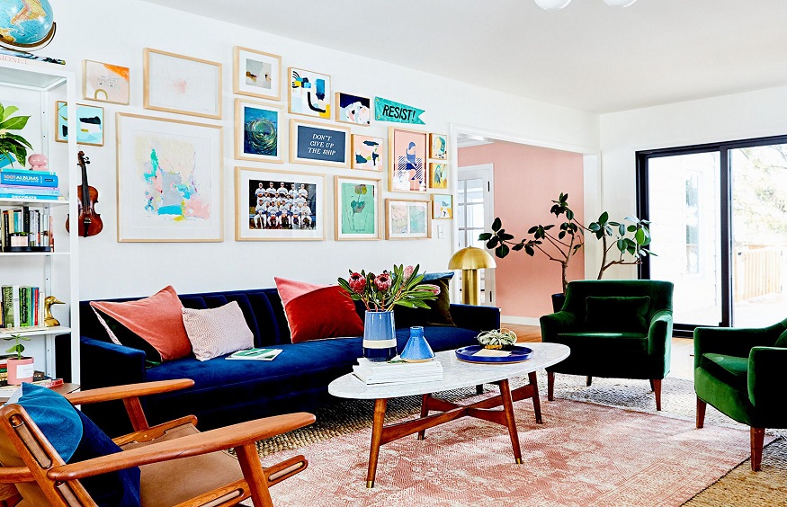
Selecting secondary colors to elevate through accents. These colors inject personality, interest, and dimension against neutral foundations. Similar to base colors, choose accent colors aligning with your defined style motivations – either vibrant, muted, monochromatic, complementary, etc. Terracotta oranges, vibrant blues, and deep greens provide striking accents. Softer accents use tones of base colors for cohesion like off-white walls with bone white molding. Metallics and black contrast modern minimalism, while antique brass and deep reds keep the farmhouse traditional. Purposefully select 2-4 accent colors with designated applications like throw pillows, entry doors, or specific walls.
Choosing a color palette feels intimidating, but methodically working through inspiration, contextual elements, and experimentation builds skill and confidence. Defining priorities for the environment you want and then trusting your judgment on suitable shades leads to environments with stunning color harmony. Soon you’ll have a signature for beautifully coordinating colors across any interior designer Santa Monica design project.


+ There are no comments
Add yours